Planner Color Coding for the ADHD Brain
Ditch generic planner color coding. Learn an ADHD-friendly system for founders that boosts focus and dopamine without the overwhelm. Step-by-step guide.
Jan Kutschera
Most planner color coding advice is backward for the ADHD brain. It treats color like decoration, as if the goal is a spread that looks tidy on Sunday night and survives contact with real work on Monday morning.
That’s why so many founders end up with a planner full of pastel ambition and zero operational value. The setup feels productive. The maintenance doesn’t. Then the whole thing gets abandoned, and you assume the problem is your follow-through.
It usually isn’t. The problem is that most planner color coding systems were built for people who can hold categories in working memory, enjoy upkeep, and don’t get pulled into a hyperfocus spiral while choosing the “right” shade of sage. An ADHD-friendly system has to do something different. It has to reduce decisions, surface priorities fast, and create enough reward to keep you using it when your week gets messy.
Table of Contents
- Why Your Pretty Planner is a Dopamine Trap
- The Science of Color for the ADHD Founder
- Designing Your 4-Color Founder System
- Mapping Your Colors Across Paper and Digital Tools
- The 15-Minute Weekly Sync to Make It Stick
- Your Color Code Is Your Cognitive Compass
Why Your Pretty Planner is a Dopamine Trap
The popular version of planner color coding is a trap. Too many categories, too many pens, too much setup, too much pressure to keep it all visually perfect.
For ADHD founders, that kind of system often fails for predictable reasons. It can trigger hyperfocus on setup, create color confusion when working memory is already overloaded, and push the brain into sensory overload instead of clarity. One analysis also notes that 70% of users in 2025 Reddit threads in r/ADHD were asking for “ADHD color coding that sticks” without finding good answers, which tells you how common this failure pattern is, not how personal it is to you (analysis of ADHD planner color-coding struggles).
Pretty systems break under founder conditions
Founders don’t have calm, uniform weeks. You’ve got investor follow-ups, team handoffs, deep work windows, admin sludge, random fires, and the ongoing temptation to do everything yourself.
A decorative planner system doesn’t help with that. It adds one more layer of interpretation. Instead of seeing a page and instantly knowing what matters, you have to remember what each color meant, whether you’re still using the same key, and why three shades of blue seemed like a good idea at the time.
That’s not organization. That’s friction.
Practical rule: If your planner color coding requires artistic energy to maintain, it won’t survive a hard week.
Most mainstream advice is neurotypically biased. It assumes consistency is easy, visual density is harmless, and categorization itself feels soothing. For an ADHD brain, the exact same features can become the reason the system dies.
Color should reduce thinking, not create it
What works is using color as cognitive architecture. Not flair. Not decoration. Not a Pinterest side quest.
That means each color has one job. It should tell your brain what kind of attention a task needs before you reread the words. That’s the difference between a planner that performs and one that just poses.
If you’ve been trapped in cycles of setup, abandonment, guilt, and restart, this is the key shift. Stop trying to build a prettier planner. Build a planner that supports the way your nervous system works, especially when motivation drops. That’s also the deeper logic behind replacing adrenaline-driven productivity with systems that support steadier reward loops, which is central to dopamine-aware business systems for ADHD founders.
The Science of Color for the ADHD Founder
Color works when it becomes a shortcut for decision-making. Your brain sees the mark and knows what mode to enter. No extra sorting. No rereading the whole page. No fresh debate about whether a task is urgent, strategic, or ignorable.
That matters if your executive function is unreliable under stress. ADHD founders usually don’t need more information. They need faster access to the right information.
Color can externalize prioritization
A controlled study on color-based memory methodology found that a step-by-step color-coding method increased productivity performance by 11% and was preferred by 52% to 58% of participants over non-color methods (medical student color-coding study). The mechanism matters more than the setting. The method worked by making key information visually distinct, then reinforcing it through repeated scanning and self-testing.
That’s useful for founders because planner color coding can do the same thing. It can turn a messy task list into a page your brain can process at a glance.
The same source notes expert insight that color can reduce cognitive load by 20% to 30% by externalizing prioritization, which is especially relevant for ADHD brains dealing with executive overload. Instead of asking yourself, “What should I do first?” every time you open the planner, the page already answers.
A good color system doesn’t help you remember more. It helps you decide with less friction.
That’s the part most advice misses. Color isn’t magic because red is “energizing” or blue is “calming.” Color becomes useful when it acts like pre-processed meaning.
Consistency is what makes color useful
The same research also carries the warning almost nobody emphasizes. Inconsistency can drop efficacy by 40% in color-coding systems. If a color means “deep work” on Monday, “client work” on Wednesday, and “important” next week, your planner stops being a support and starts becoming a puzzle.
That’s why ADHD-friendly planner color coding has to be brutally stable.
Use the same meanings everywhere:
- Same color in your planner
- Same color in your calendar
- Same color in your task manager
- Same color in your team handoff notes
Once the cue becomes automatic, the system starts doing work for you. That’s the broader principle behind interest-based nervous system support for ADHD productivity. You’re not relying on effort to recreate clarity every day. You’re engineering clarity into the environment.
The real benefit isn’t neatness
The main win is less mental drag.
A strong planner color coding system gives you a page that answers four questions fast:
- What needs urgency
- What deserves focus
- What should move to someone else
- What keeps the machine running
That’s why minimalist systems stick. They don’t ask your brain to admire the planner. They ask your brain to use it.
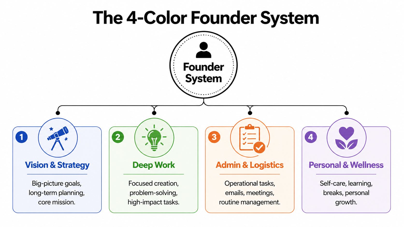
Designing Your 4-Color Founder System
If you want planner color coding to stick, use fewer colors and better categories. Not “work” and “personal.” Not “meetings” and “emails.” Those labels are too broad to guide action.
A founder needs a color system that reflects actual decisions. What must happen now, what needs focused creation, what should move through the team, and what keeps the business and body operational.
Use categories your brain can act on
The benchmark data on color systems is useful here. It shows planner color coding can cut task identification time by 35%, and the recommended setup is 4 to 6 colors maximum, because going beyond six can increase cognitive overload by 28% (productivity benchmarks on color psychology). Four colors is enough structure without turning your planner into stained glass.
Here’s the system I’d use for almost every ADHD founder.
-
Red for high-stakes tasks
Use this for genuine urgency. Deadlines, legal items, payroll approvals, make-or-break client deliverables, time-sensitive decisions. Red should be scarce. If everything is red, nothing is. -
Green for genius-zone work
This is the work only you should do. Strategy, writing, offer design, problem-solving, creative direction, product thinking. Green is where founder value usually lives. -
Blue for delegation and handoffs
If a task involves assigning, reviewing, clarifying, or unblocking someone else, mark it blue. This keeps team work visible without mixing it into your own deep-work list. -
Orange for maintenance
Admin, invoicing, scheduling, inbox cleanup, documentation, and the boring but necessary tasks that keep the company and your life from wobbling.
Notice what’s missing. No separate colors for “calls,” “personal,” “content,” “clients,” “ideas,” or “errands.” Those are formats or contexts, not decision categories.
Choose colors for function, not aesthetics
Color psychology helps if you use it sparingly. Green is especially useful because benchmark guidance notes that using green for completion can support reward pathways and sustain motivation by 15% to 20% compared with black ink in this context. That makes it a smart home for genius-zone work and visible wins, especially if you mark completed deep-work blocks with a green check.
Working rule: choose colors your eye can distinguish instantly, not colors that “go together.”
A few setup guidelines matter more than brand or stationery choice:
- Keep the palette high-contrast. Soft shades may look nice but often scan poorly when you’re tired.
- Use one movable key. A planner card, sticky note, or dashboard widget beats trying to memorize anything.
- Reserve red. The benchmark recommendation aims for less than 20% red in the mix to avoid burnout patterns.
- Don’t add “just one more category.” The fifth and sixth colors are where most systems start drifting.
If you work in focused sprints, pair the green category with blocks inside a 90-minute focus system for ADHD time management. The color tells you what kind of work belongs there. The time block tells you when it will happen.
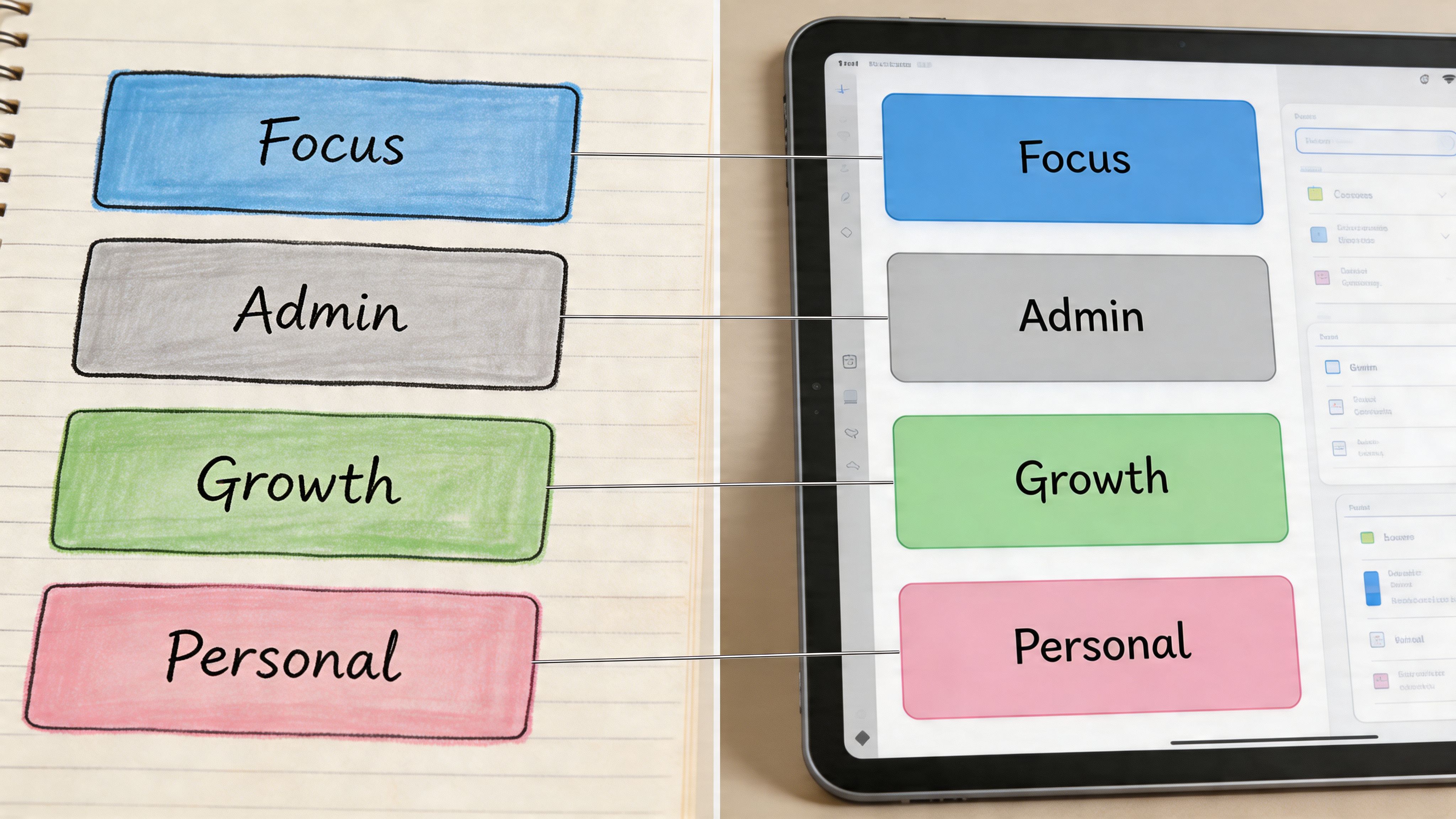
Mapping Your Colors Across Paper and Digital Tools
A planner color coding system fails fast when it lives in only one place. If your paper planner says one thing, Google Calendar says another, and Asana has no matching signal at all, your brain has to translate constantly. Translation is where friction sneaks in.
Use one visual language across every tool you touch in a normal week.
A founder day with one color language
Say you start Monday with a paper planner, Google Calendar, and Asana.
On paper, you write:
- Green block from 9:00 to 10:30 for offer strategy
- Blue note to review a designer handoff
- Orange line item for invoice approvals
- Red box for the contract deadline that cannot slip
In Google Calendar, those same blocks use the same color meanings. In Asana, project tags or custom fields mirror them. In Notion, your database view uses the same labels. If you’re using Apple Reminders or Todoist instead, same rule.
The point isn’t tool purity. It’s recognition speed.
When you open any one of those tools, your brain should get the same answer instantly. Green means “protect this.” Blue means “move work through people.” Orange means “keep the machine running.” Red means “don’t miss this.”
That’s how planner color coding becomes operational instead of decorative.
The 4-Color Founder System Cheat Sheet
| Color | Category | Core Function | Example Tasks |
|---|---|---|---|
| Red | High-stakes | Protect deadlines and critical decisions | Contract review, payroll approval, launch deadline |
| Green | Genius zone | Reserve founder-only high-value work | Strategy, writing, product decisions, creative direction |
| Blue | Delegation | Track handoffs and team movement | Assign task, review draft, unblock team member |
| Orange | Maintenance | Handle admin and operational upkeep | Invoicing, email triage, scheduling, documentation |
A few paper setups work well for this. A Full Focus Planner, Hobonichi Weeks, Leuchtturm notebook, or even a legal pad can all handle the system if you keep the marks simple. Use one pen plus a few highlighters, or use colored dots in the margin if highlighting feels messy.
Digital setups need the same restraint:
- Google Calendar for colored time blocks
- Asana custom fields or tags for category visibility
- Notion select properties with the same labels
- Todoist labels if you want a lighter task manager
- Apple Calendar if you prefer less complexity
This short walkthrough shows the principle well in action:
What doesn’t work is mixing meanings by platform. Don’t let green mean “marketing” in Asana and “deep work” in your paper planner. Don’t use blue for meetings just because your calendar app defaulted to it. Defaults are for software. Your system is for your brain.
The 15-Minute Weekly Sync to Make It Stick
The system lives or dies in maintenance. Not setup. Not pen choice. Not whether your planner has premium paper.
ADHD brains are famous for building a beautiful system and then drifting away from it. That doesn’t mean the idea was wrong. It means the upkeep was vague.
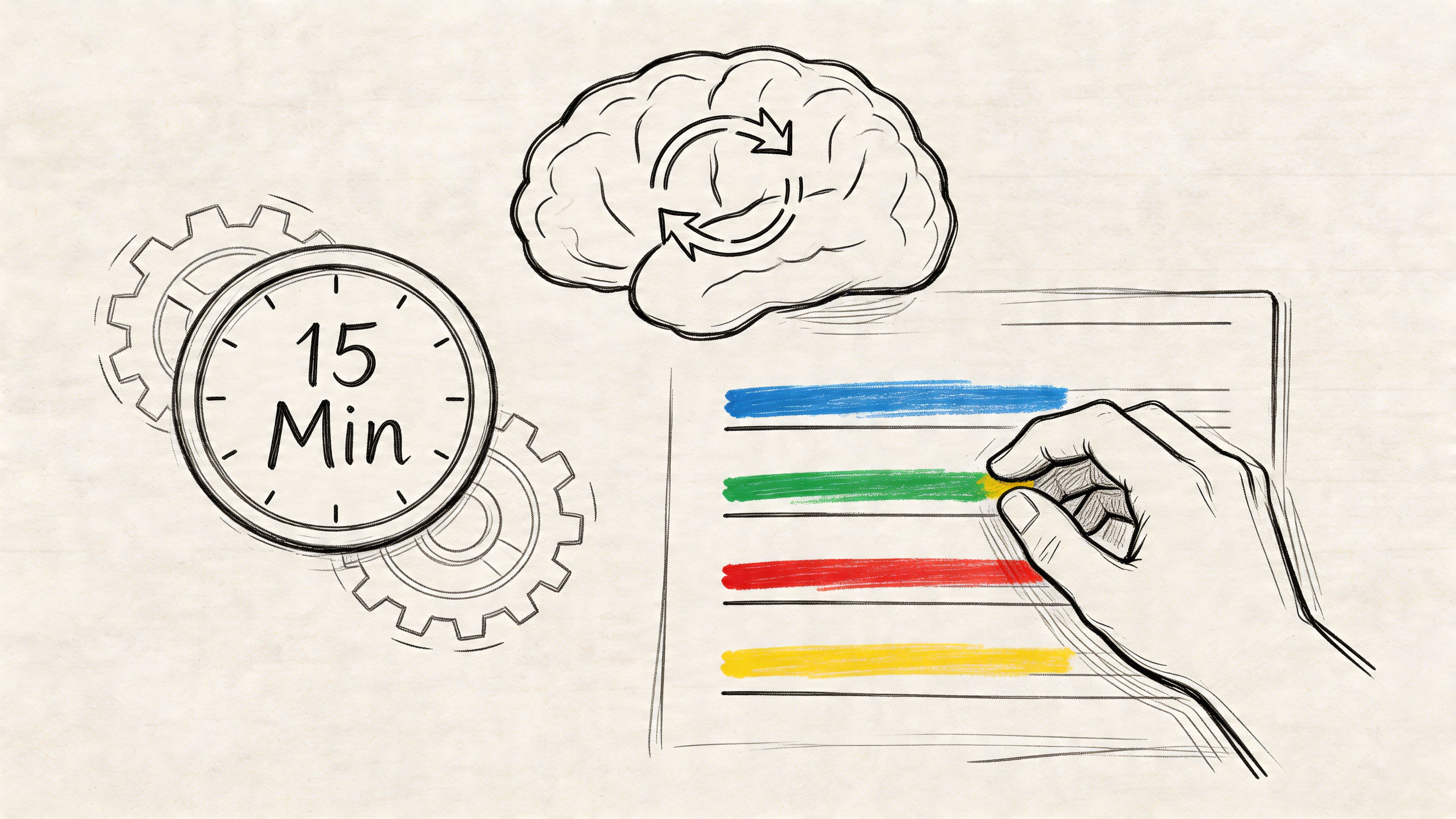
The weekly ritual
Keep this review to 15 minutes. Short enough to avoid dread. Structured enough to prevent drift.
-
Brain-dump first
Write every open loop for the coming week. Don’t categorize while dumping. Get it out. -
Assign the four colors
Mark each item red, green, blue, or orange. If something doesn’t fit, the task is probably too vague and needs rewriting. -
Migrate unfinished tasks Move leftover items forward only if they still matter. Irrelevant tasks often harbor old guilt. Don’t auto-copy everything.
-
Block the week
Put green work where your brain is strongest. Place blue check-ins where team movement needs support. Put orange tasks in lower-energy zones. Keep red visible. -
Schedule the next sync before you stop
If the next review isn’t already on the calendar, the system is running on hope.
Missing one week isn’t the problem. Losing the review ritual is.
What not to do during the sync
A weekly sync goes bad when it turns into planner theater.
Avoid these traps:
-
Rebuilding the whole system
You do not need a new legend, cleaner handwriting, or a fresh notebook every Sunday. -
Adding categories because this week felt weird
Edge cases don’t deserve permanent colors. -
Using the sync as punishment
The review is for recalibration, not self-criticism. -
Overfilling red
If you tag half the week as urgent, you’ve recreated panic productivity in color.
A useful sync feels slightly boring. That’s a compliment. Boring systems survive chaotic seasons because they don’t depend on inspiration.
Your Color Code Is Your Cognitive Compass
Planner color coding works when you stop asking it to make the page beautiful and start asking it to make the day navigable.
That’s the fundamental shift. Color becomes a cognitive compass. It points your attention where it needs to go before stress, novelty, and random urgency scatter it. Instead of making a hundred tiny prioritization decisions, you let the environment hold part of that load for you.
For ADHD founders, that matters more than aesthetics ever will.
This is about trust, not stationery
A sustainable system does something rare. It helps you trust what you see.
You open the planner and know:
- red needs protection
- green deserves your best brain
- blue keeps the team moving
- orange keeps life and business from fraying at the edges
That level of clarity changes more than your notes. It changes how you enter the week. You stop reacting to whatever pings first. You stop confusing activity with traction. You stop using adrenaline as your primary sorting mechanism.
Your planner shouldn’t ask you to become a different person. It should help the person you already are operate with less friction.
The system that sticks is the one you can still use on a bad day
That’s the standard that matters. Not whether the spread is elegant. Not whether the colors match your desk setup. Not whether someone on social media would call it organized.
The only planner color coding system that tends to last is the one that remains usable when you’re tired, behind, overstimulated, and tempted to give up on structure entirely. Minimal colors. Stable meanings. One weekly reset. Same language across paper and digital.
You are not bad at planning because pretty systems keep dying in your hands. You were handed systems that demanded too much maintenance and gave too little cognitive support in return.
Build the planner like a tool. Let color carry meaning. Let meaning reduce effort. That’s when a planner stops being an aspirational object and starts becoming a reliable operating system.
If you want help building systems like this into the rest of your business, Jan Kutschera teaches ADHD founders how to replace burnout-driven hustle with practical operating systems for focus, delegation, and steady execution. His work is especially useful if you’ve built success through urgency and now want something that lasts.
Jan Kutschera
German founder, diagnosed with ADHD at 51. Built 4 agencies, now building systems for neurodivergent entrepreneurs. German engineering for the ADHD brain.
Connect on LinkedInRelated Articles

ADHD-Friendly: Build A Multiple Timer App System
Beat panic productivity. Use a multiple timer app for an ADHD-friendly system. Covers setup, workflows, and real-world use.

ADHD Project Planning Notebook: A Founder's Guide
Ditch the chaos. Learn to build a project planning notebook for the ADHD founder. This guide covers dopamine-engineered layouts, delegation, and more.

Founder Focus: Master pomodoro technique adhd System
Pomodoro technique adhd - Ditch generic advice! This neuroscience-backed system applies the pomodoro technique adhd for founders to engineer focus, manage